Stay Fruity Cutie
Project Description:
The non-profit organization, It Gets Better, an advocate for queer rights was looking for merchandise lines to sell at pride – I rose to the challenge creating collateral items drawn from the modern queer community.
Challenge:
To visually communicate concepts into tangible merchandise that would resonate with the queer community, done in a 24 hour design-for-good marathon.
Dates: January 19 -20, 2024
Location: Cal Poly Pomona
Partners: It Gets Better
Audience: Attendees of LA Pride Parade
Team Members: Paulina Vitarella, Fernanda Castillo, Alyssa Moore, Lauren Villa Santo
Every year the Cal Poly Pomona chapter of AIGA hosts a 24 hour design for good marathon where a select number of designers design for a nonprofit organization for 24 hours nonstop. I have participated in this challenge in both 2023 and 2024 and it is a challenge! I am by no means a person who stays up for 24 hours - I pride myself on getting 8 hours of sleep consistently. But in the spirit of designing for the greater cause, I chose to forego my sleep schedule and design for good.
In 2023, I designed for the organization, Friends in Deed, as part of the printed media team. This time around (2024) I led a team designing collateral items for the non-profit organization: It Gets Better. It Gets Better is an organization that aims to “uplift, empower, and connect lesbian, gay, bisexual, transgender, andqueer (LGBTQ+) youth around the globe.” This organization had recently undergone a brand refresh and was gearing up for the LA Pride Parade that they table at every year. With the new brand look, It Gets Better was looking to the design students at Cal Poly Pomona to help design their booth, social media templates, Twitch emotes, and collateral items. I had the honor of leading a team of 5 wonderful designers creating lines of merchandise to be sold at LA Pride. I functioned as both a leader and art director of the Collateral Team as well as a Designer creating my own line of merchandise. In my case study I will be taking you through the 24 hour design process of my merchandise line: “Stay Fruity Cutie.”
11:00 am January 19, 2024 - Design Brief
Gathered in a bright yellow room, myself and 24 other designers gathered for our design brief with lead designer of It Gets Better, Jay Taylor (they/them). Taylor explained that It Gets Better had recently undergone a brand refresh and was looking for a variety of items to be designer for their booth and the annual LA Pride Parade. The Collateral Team's challenge was to create items to be sold at their booth in line with the new brand guidelines. My team's challenge was by far the most open-ended one. Taylor was looking for designs that would resonate with the queer community - but that was the extent of our restrictions. They gave us the logo, brand colors and typography and we were off to design!
1:00 pm January 19, 2024 - Brainstorming
After a lunch break and a brisk walk around the campus the design process began. As someone who has to treat themselves as a hungry toddler when approaching design challenges as big as this one I broke up my and my team's time into 4 chunks interspersed with snack and walk breaks. The 3 distinct chunks were: Brainstorming, Group Revision 1, Critique, and Finalizing. This will be the structure I will use to walk you through the design process of “Stay Fruity Cutie.” I hope you enjoy and don’t forget to take snack breaks :)
In the simplest terms, brainstorming was a rapid fire, chaos spitball of ideas interspersed with scratchy drawings and laughter. The brainstorming process was done as a team because I have found that this stage of the design process is best undergone with creative company. Ideas were being thrown around, word association games were played and collectively we began to form concepts. As someone who is part of the queer community myself, I used that in my position as lead of this team to help hone in ideas that were both respectful to the queer community while also resonating with them. Each person's experience is so unique we ran into am ethical wall of how to represent queer people as a whole through imagery. After much discussion of how to respectfully represent this community without generalizing or excluding any one identity we decided that human representations were out the door instead we chose to hone in on non-human representations like animals, flowers and fruit.
(tbd on the sketches, they're packed away in a box)
2:00 pm January 19, 2024 - Snack Break
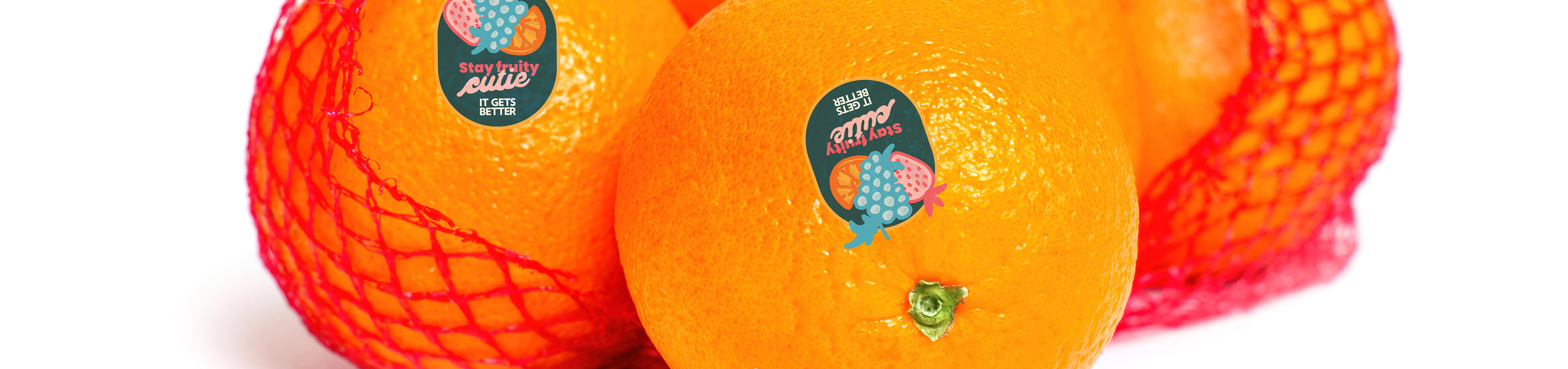
In true toddler fashion my snack of choice that day was a cutie. As someone who has an affinity for puns and word play I recalled one of my favorite phrases associated with the modern queer community: stay fruity, which soon became stay fruity cutie. I had established my concept. In line with of the resilience of the LGBTQ+ community, I wanted to play my part in reclaiming the word "fruit" in this community through positive design.

Wordmark
4:00 pm January 19, 2024 - Group Revision 1
At this point myself and my team each had a concept they were working towards. Our first design stint was to consolidate our thoughts in some sort of visual way so we have a starting point to create our merchandise lines from. I chose a poster.

Concept Poster
Through the creation of the poster I delved the copy of the concept further with the main copy being "Stay Fruity Cutie" and the secondary copy being "live organically love organically. With the concept stemming from cuties I had to create a label for a cutie bag to flesh out my idea. The fruit imagery at the center of the fruit label was drawn by Paulina Vitarella, while the rest of the line was created by me. The fruit imagery was pulled from another idea my team was considering but ultimately we found it worked better in this concept.
6:30 pm January 19, 2024 - Group Revision 2
Now that my team had a visual representation of our concepts we came back together as a group for feedback and to discuss how to go about the next step of design. In the face of the open-ended challenge of creating any form of merchandise to be sold at LA Pride, I saw the need for a standardized set of collateral items to translate our concepts onto. I decided that the items we would be created was a shirt, a tote bag, a fan and one more item that fit best with our concept.
7:00 pm January 19, 2024 - Dinner and a Walk
We had chipotle!
8:00 pm January 19, 2024 - Guest Critique
After having time to refine my ideas it was time to bring in outside eyes for feedback. The designers of this design marathon had the wonderful opportunity to bounce ideas off of a variety of design professionals and Cal Poly Pomona Alumni through an in-person presentation format. Each team had the opportunity to present their work to the rest of the designers participating in this challenge and the guest critics. I presented my concept through fleshed out imagery of a branded fruit tag along with a funny and playful color palette.

Main Graphic & Color Palette
10:00 pm January 19, 2024 - Nap time
Much needed nap time.
12:00 am to 10:00 am January 20, 2024 - The Final Stretch
This was by far the longest design stint. All the hard brain decisions had been made in terms of concept and rounds of feedback now it was time to knock out some collateral items. As a result I came out the other end with a line of shirts, a tote bag, a fan, a bag of cuties and a cutie-shaped stress ball.
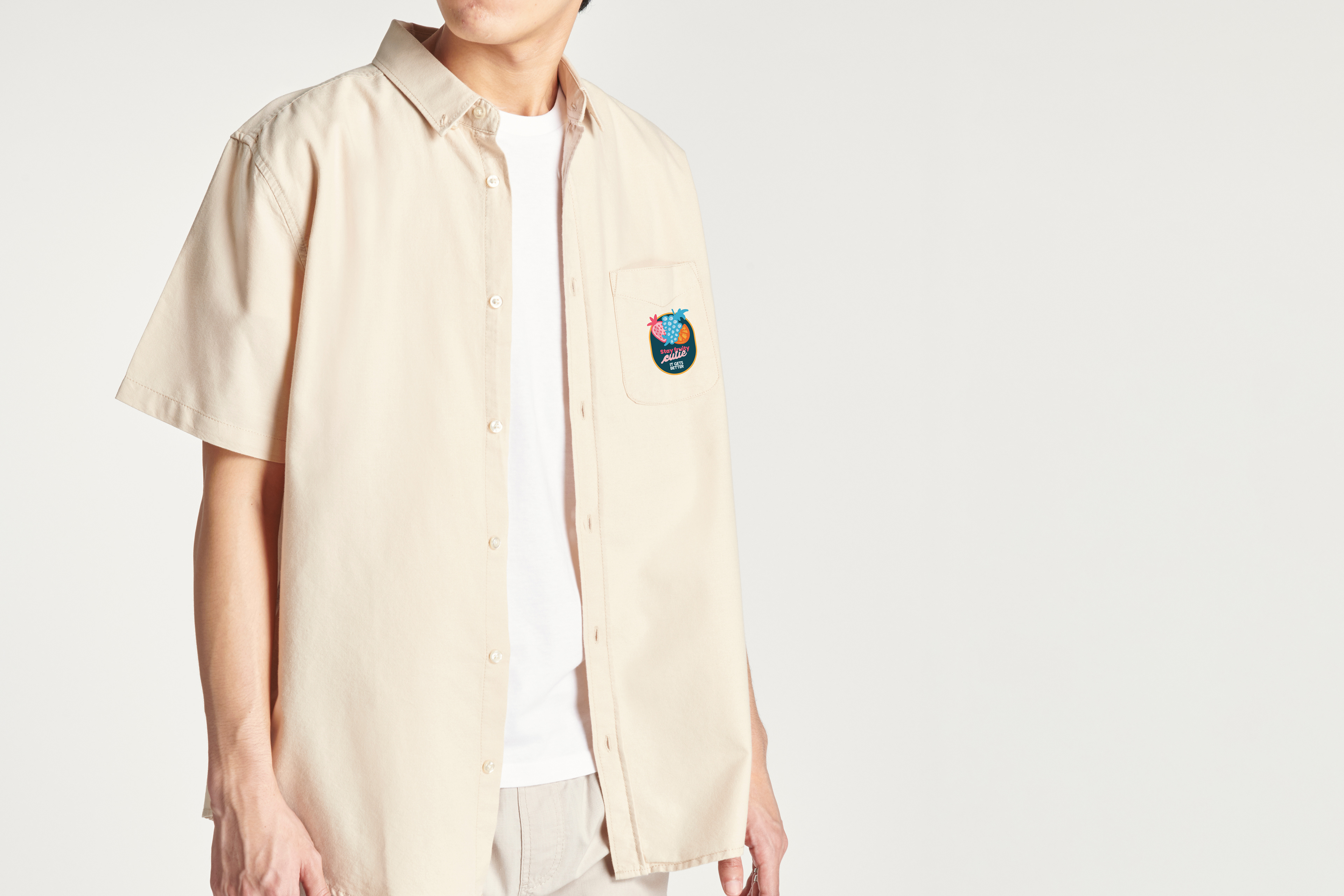
Button Up

Crop Top
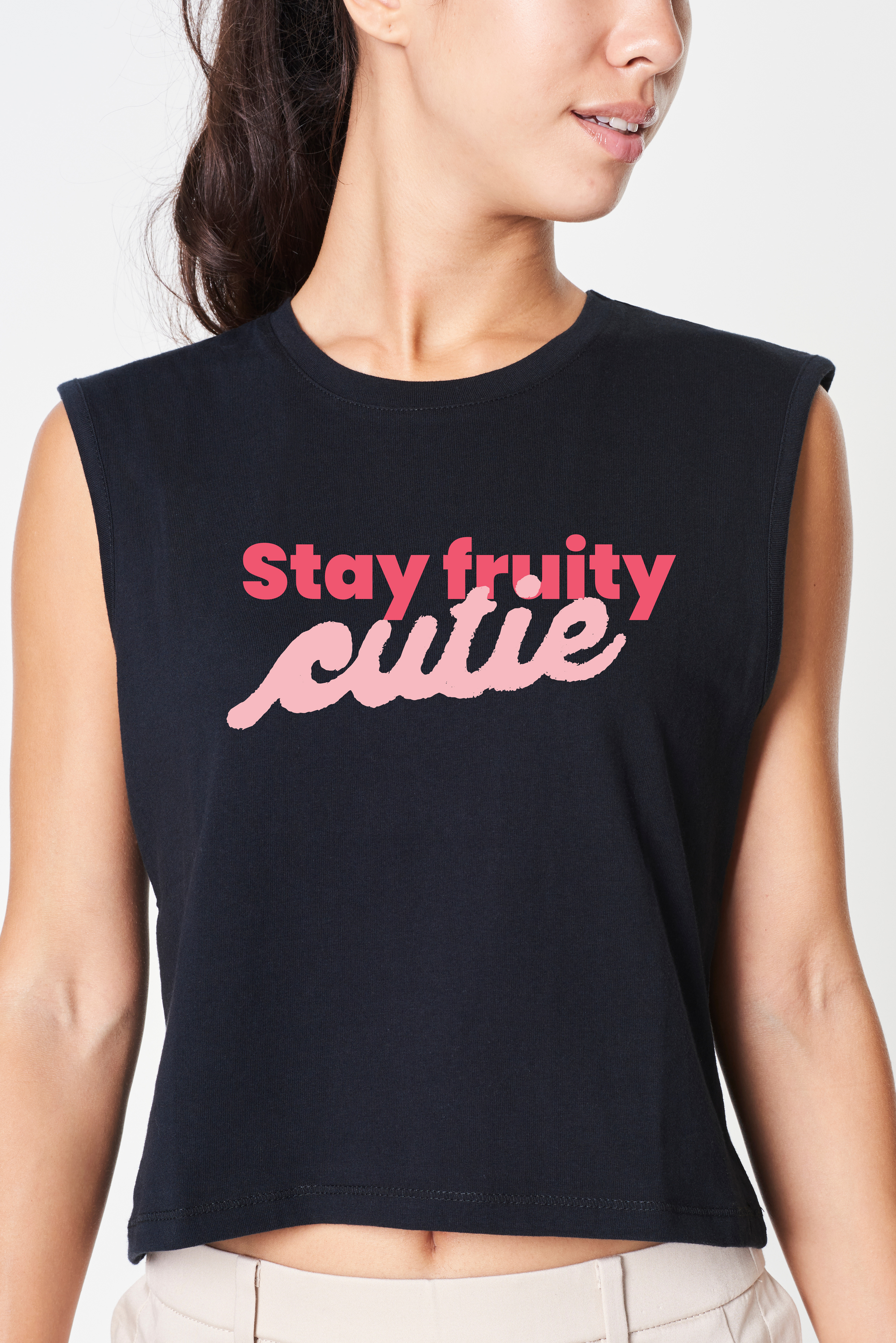
Tank
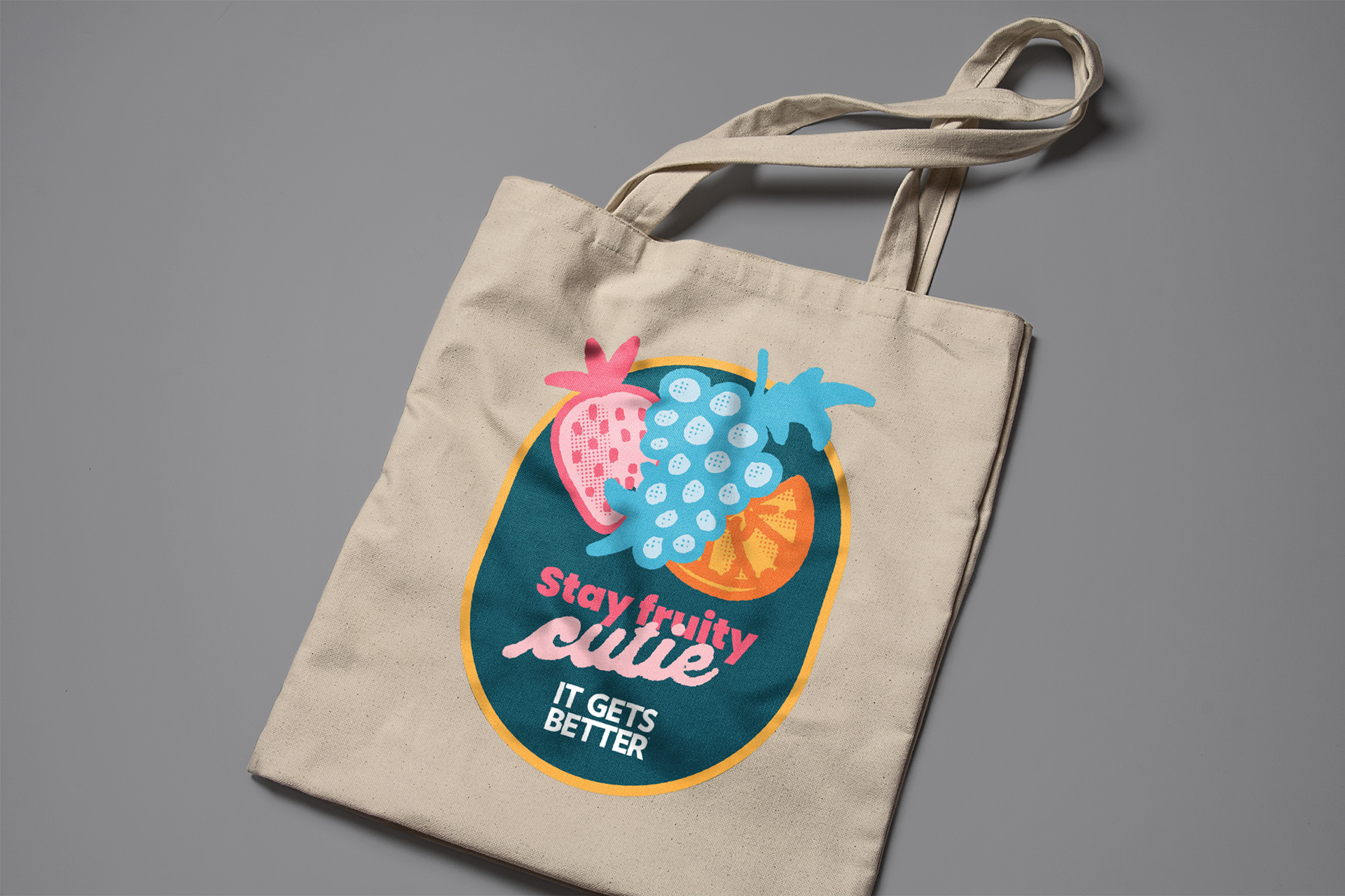
Tote Bag
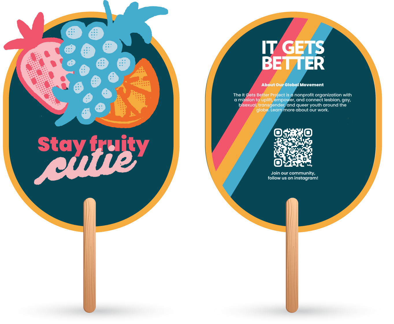
Hand-held fan intended to be used during the June heat of the LA Pride Parade
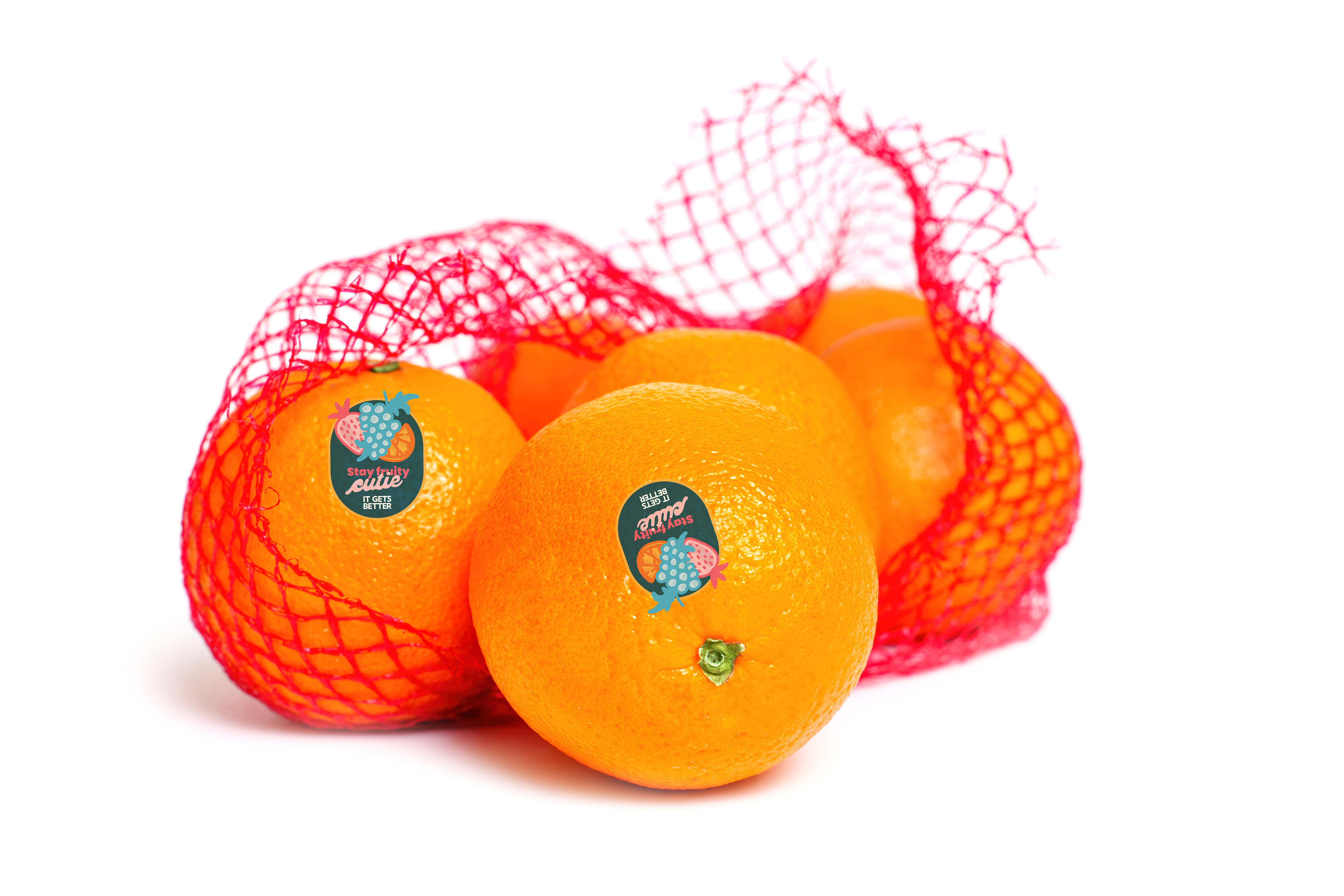
Bag of Cuties with branded fruit tag
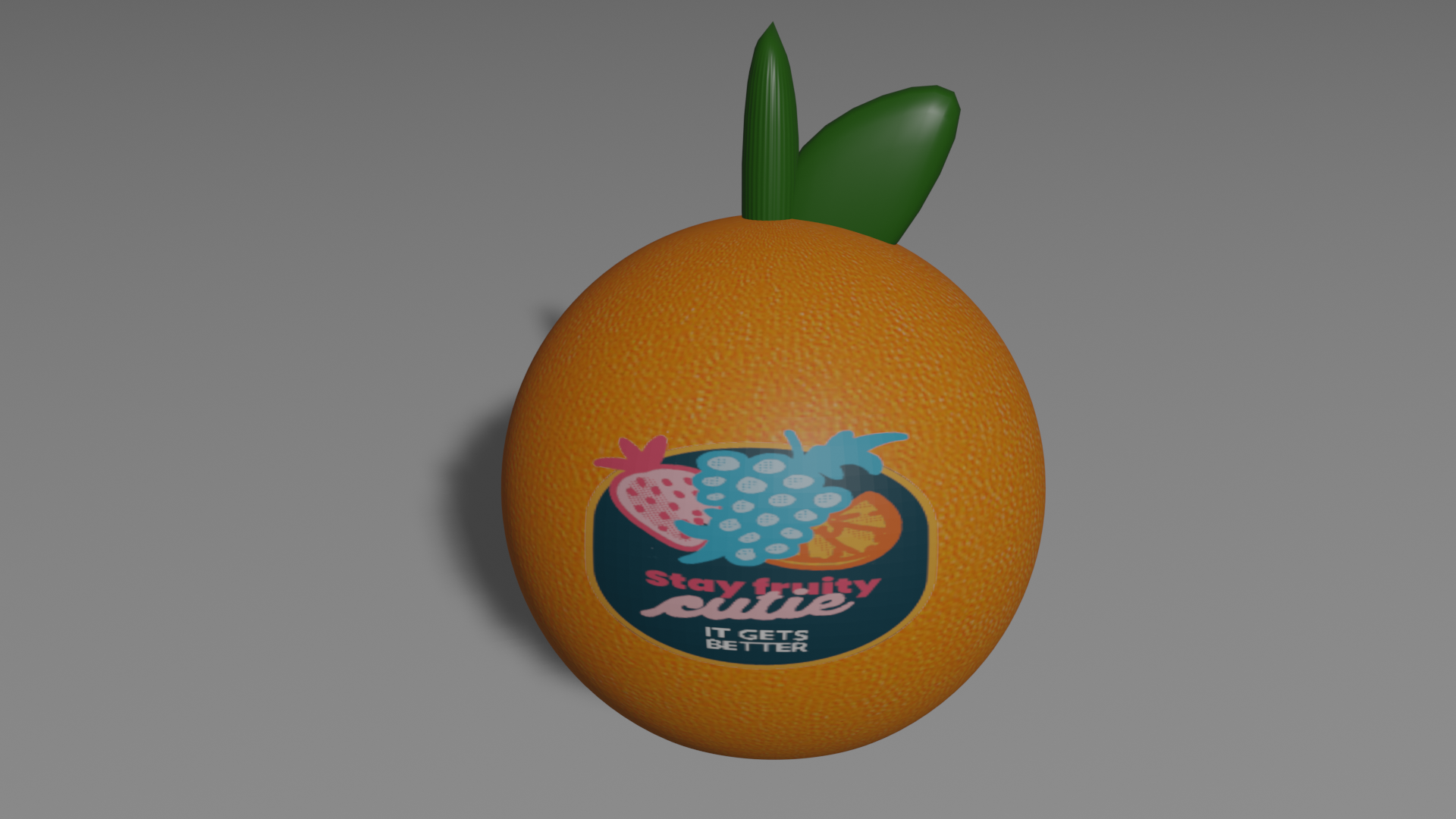
Stress ball 3D rendered by Ty Monzon and Nick Tong
I hope you enjoyed and stay fruity, cutie!